Android Emulator Snapshot

Here I'm going to describe a simple way to decrease a start up time of the Android Emulator. This is possible after snapshot saving and loading option is enabled.

Open your terminal and enter the command:

$ android

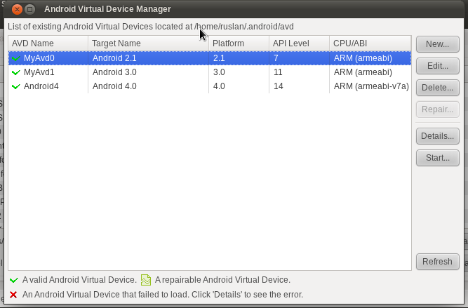
Open Android Virtual Device Manager from menu Tools -> Manage AVDs... You'll see a window like this:


AVD Manager


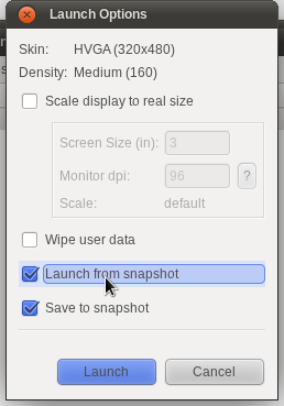
Select your working AVD from the list and click on "Edit" button. In the opened dialog check on to enable Snapshot. Save changes. Then click on the "Start..." button and check "Launch from snapshot" and "Save to snapshot" options.


Launch options


If you haven't enabled "Saving to snapshot" option before, it may take a time to start the emulator first time. After it is started, you can close it and start again. This time emulator will be started much faster.

MOBI version of The Architecture of Open Source Applications book

The Architecture of Open Source Applications is a great book where one can find the description of the architecture of the 25 open source applications, like Eclipse, LLVM, Mercurial, HDFS and Berkley DB. This book is free to read in the HTML format online, but if you want to get a PDF or Kindle version, you'll need to buy it either at Lulu.com or at Amazon.com.

Of course the recommended way is to buy the book, as all royalties from these sales will be donated to Amnesty International. But you can download a MOBI version for Kindle of this book for free, just continue reading.

First, want to tell a short story. After I found a free SICP version for Kindle compiled from HTML files at github.com/twcamper/sicp-kindle, I was looking for a chance to create something like that myself. And then I found the AOSA book. It has an HTML version, and I wanted to have a MOBI version to read it in my Kindle.

And so I made a Kindle version of The Architecture of Open Source Applications book and currently it's available from github.com/rkhmelyuk/aosa-mobi.

Download a Kindle version of the AOSA

SyncTab

I've released today an updated version of a SyncTab Android application.

Well, a few words about what is a SyncTab. SyncTab is an application to send an interesting links and browser tabs from Android phone to desktop browser (current only Chrome is supported). To start using SyncTab, user need only to download and install Android application and Chrome extension. User will need to register an account using either Android application or Chrome extension and then he/she can easily send tabs from phone to desktop. There is more information about this in the Getting Started article.

So what's new in the version 0.6? Not much:
  • added an about page to show current user name, website link, link to submit issue or contact
  • get the correct page title and description with regards to the page charset

But I have more plans for version 0.7:
  • share tabs from browser to the phone
  • tag and filter shared tabs

So try SyncTab now, and wait for a new features.

Mobile website with jQuery Mobile

In my previous post I've described how to add support of mobile version of website using django. In this post I'm going to stop on front-end side of mobile website.

From the beginning, I wanted to create a simple mobile version from scratch and use a similar to original website look. But, after some investigation, I've changed my plans. I decided to use some framework to create a mobile website. So I found two popular such frameworks: Sencha Touch and jQuery Mobile. Whilst Sencha Touch looks awesome and production ready, while jQuery Mobile is still in release candidate stage, I stopped on the second one. This choice was very simple for me: jQuery products usually are qualitative, there is a strong community behind them and they introduce new versions very quick. Nevertheless Sencha Touch is a good product too.

I'm not going to describe how I used jQuery Mobile step by step, but only list of some facts and tips. First of all, I was using jQuery Mobile version 1.0 RC2, and that means, it wasn't a production-ready version yet. Even so, I found a few bugs or maybe just a things that need an improvement.

I just love such structures as lists. So will list a fact using a list =).
  • You should read a manual first and follow a standard layout mechanism, like declare header, content and footer sections. This will save you a lot of time.


    <div data-role="page">
               <div data-role="header">
                   <a href="{% url m_home %}" data-icon="home" class="ui-btn-left">Home</a>
                   <a href="{% url m_help %}" data-icon="help" class="ui-btn-right">Help</a>
                  {% block header %} <h1>[App Name]</h1>{% endblock %}
               </div>
    
               <div data-role="content">
                {% block content %}{% endblock %}
               </div>
    
               <div id="footer" data-role="footer">  Copyright © 2011 ... </div>
           </div>
    

    It's a good practice to add Home/Back and Help buttons to the header or footer panel. The navigation bar can be also added to the header, where it looks very natural:


    <div data-role="header">
       <a href="{% url m_home %}" data-icon="home" class="ui-btn-left">Home</a>
       <a href="{% url m_help %}" data-icon="help" class="ui-btn-right">Help</a>
       {% block header %}<h1>[AppName]</h1>{% endblock %}
    
       <div data-role="navbar">
          <ul>
             <li><a href="{% url m_download %}">Download</a></li>
             <li><a href="{% url m_contact %}">Contact</a></li>
             ...
          </ul>
       </div>
    </div>
    
  • Fixed position of header and footer isn't working as it's expected. Well, expected it to be fixed always, while content is scrolling. But currently it just disappears when user starts scrolling and shows back after a second or so scrolling is ended.
  • Hash anchor links (#something) aren't working yet.
  • Can't show an image as a page, instead shows an "undefined" text. If you have a links that reference images, you must specify rel="external" for them.
  • Use header to specify page title, rather than do it in the h1 element in the content section.
  • Use collapsible blocks for long pages. For instance, I've found them very helpful to organize a help page with many different topics.

    You may also want to embrace collapsible blocks using collapsible set.
  • For large image, don't show original version of it on page, but prefer thumbnail image as a link to the original version of image.
  • Use list view where possible. For instance, a main help page contains a list of articles which are references to the appropriate pages.
  • Buttons should be with icons where possible. You can easily add icon to the button with the data-icon="[icon]" attribute. The list of available icons is on jQuery Mobile website.
  • Make website as simple as possible: structure should be simple, navigation bar should contain only the most used links. Remember, that it's still hard to work fully with websites on mobiles.

Well, that's all as for now. Hope that would be helpful.

Mobile website with Django

Although I'm not a web guy, but more specialized on backend logic, I had a very interesting experience today creating a website version for mobiles. I had a simple website with a few pages, minimum server side logic and a slice of documentation there. This website perfectly works for desktop and tablet browsers, but is not that good for mobiles. I use to call this website as "normal" version throughout this post. It's important to have a working mobile version of website, as website is about Android application.

A little bit about technologies and task. Website is running on Django as well as mobile version should be too. Mobile version of website should be much simpler than normal version, not so beautiful, but must do own job well: allow users to know about the product, download and access to the documentation.

I decided to use the same django application for both normal and mobile website versions. I found a few different ways to add mobile website, for example: redirect to another django application, replace TEMPLATE_DIRS setting with a version that points to mobile templates if user is using mobile browser or just check and use different logic/templates in every view method. As I wanted to have a different structure for mobile website, I decided to go by my own way.

Mobile website path should be prefixed with /m/ rather than be the same or use a different domain name. So, if normal website download page is http://example.com/download/, then mobile download page should be http://example.com/m/download/. Django should check every user request whether it's from mobile browser or not using a User-Agent metadata, and if so, redirect to the mobile version of the page. In other words, if user opens a /download/ page from mobile browser, then she will be redirected to the /m/download/ page. But if she opens a /m/download page, then no redirects happen - just a mobile version of page is returned to user.

I've created different templates and views for mobile version of website. Normal version of website has references only to the normal pages and mobile version of website has references only to the mobile pages. This was done to avoid not necessary redirects that could slow down a work with website. Thus, I had a different version of URL patterns for website in project's urls.py:


urlpatterns = patterns('website.views',
    url(r'^$', 'home', name='home'),
    url(r'^download/$', 'download', name='download'),
    url(r'^screenshots/$', 'screenshots', name='screenshots'),
    url(r'^contact/$', 'contact', name='contact'),
    ... 
)

urlpatterns += patterns('website.mobile',
    url(r'^m/$', 'home', name='m_home'),
    url(r'^m/download/$', 'download', name='m_download'),
    url(r'^m/screenshots/$', 'screenshots', name='m_screenshots'),
    url(r'^m/contact/$', 'contact', name='m_contact'),
    ...
)
As you see, website.views are responsible for handling normal website pages, while website.mobile for handling mobile website pages.

Now need to redirect mobile browser users to the mobile version of website. For this purpose, I wrote a custom middleware called MobileWebsiteMiddleware. The task of this middleware is to check if user is from a popular mobile platform and needs to be redirected to the mobile version of website. The other responsibility is to redirect users from mobile to the normal version of website in case if request isn't from mobile browser. This is an extract option, that should be disabled while testing.


class MobileWebsiteMiddleware(object):

    MOBILE_PREFIX = '/m/'
    MOBI_REG = re.compile(
        '(iphone|windows ce|mobile|phone|symbian|mini|pda|ipod|mobi|blackberry|playbook|vodafone|kindle)',
        re.IGNORECASE)

    def process_request(self, request):

        if 'HTTP_USER_AGENT' in request.META:
            userAgent = request.META.get('HTTP_USER_AGENT')
            matches = self.MOBI_REG.search(userAgent)
            path = request.path_info

            if matches:
                # from mobile browser, check if need to redirect to mobile
                if not path.startswith(self.MOBILE_PREFIX):
                    # need to redirect to mobile version
                    return HttpResponseRedirect('/m' + path)
            elif path.startswith(self.MOBILE_PREFIX):
                    # need to redirect to normal version
                    return HttpResponseRedirect(path[2:])

        return None

If you'll check the list list of user agent patterns in MOBI_REG you wouldn't find neither iPad nor Android. I want to show a "normal" website for tablets. "Android" keyword is used in User Agent for both mobiles and tablets. While Mobile Android browsers pass a User Agent with a "mobile" keyword, but Tablet Android browsers don't do that. Thus, I will have a normal version for desktop and tablets browsers, but mobile version for mobiles and Kindle.

Now I have a simple website, that has two different version: one for desktop and tablet browsers and another for mobile browsers. User will be automatically redirected to the right version of website which depends on used device.

In my next post I'm going to tell more about using jQuery Mobile to build a mobile version of website.